Print version of this Book (PDF file)
Widget Descriptions
This section describes the widgets that are listed in the Select Type dropdown box in the Widget Properties dialog box.
Check Box
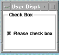
The Check Box widget is actually a toggle box. It has a Toggle State of 1 or 0.
To assign a variable, such as checkVal to a variable it must be declared in a variables table. For example, the Model Variables Table is accessed through the Model Variables tab. Each time you click in the box, checkVal will toggle between the binary values 1 and 0.
After selecting Check Box in the Widget Properties dialog box, select Toggle State from the Options list. This can be set to Toggle On or Toggle Off. Then select Track Variable and type checkVal into the Variable box.
Toggle State
Toggles a value between 1 and 0 each time the box is checked.
See Using the Properties Dialog Box.
Dropdown Combo
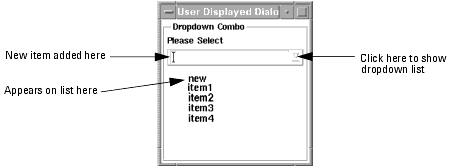
The Dropdown Combo widget enables you to choose from a large dropdown list, which disappears after use to save space.
The Dropdown Combo is editable in that the user can add items by typing them in the top editable box as well as choose them from a list. When Enter is pressed on the keyboard the new item is added to the displayed list. The widget can also be configured to automatically add new entries to the list.
The items displayed in the dropdown list are declared, for example, in an array in the Model Variables table as shown below. listElems is declared as an ICCAP_ARRAY of size 4, and the four values are defined individually for each element of the array.
After selecting Dropdown Combo in the Widget Properties dialog box, select the option Items. Then click the box captioned Please enter the name of an ICCAP_ARRAY and type listElems. Click both OK buttons.
To return a value from the dropdown list, select the option Selected Index. Click on Track Variable and then in the Variable box enter, for example, index. The item selected will be listElems[index]. The variable name index, of course, must be declared, for example in the Model Variables table.
To set the Dropdown Combo to be user extendable, select the option Add Entry on <Enter>
The dialog box will show <none specified>
Click on the activate button at the right of the New Value box and select TRUE.
Click on OK in the box below it, and then OK at the bottom left.
The dropdown Combo will now have a cursor indicating that it is editable.
Display the Dropdown Combo and edit the contents of the edit field, then press Enter. Pressing Enter causes the contents of the edit field window to be added to the list of items.
Next time you press on the activate button, the last new item added will be shown at the top of the list.
See Using the Properties Dialog Box.
Dropdown List Combo
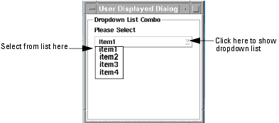
The Dropdown List Combo is the same as the Dropdown Combo except that the users must select entries from the list, and cannot type their entries by hand.
See previous item: Dropdown Combo.
See Using the Properties Dialog Box.
Edit Text
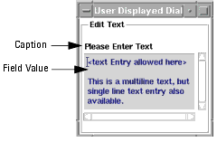
The Edit Text box serves primarily as an input where the user can enter and change the value of numbers or strings of text. However it also operates as a monitor in that will show the new values of a variable or text string any time that variable changes.
Fixed Label
To show a fixed (hard coded) title, in the Widget Properties dialog box, select Caption from the Options list. Then select the Track Variable box to set it to off (no x shown in it). Then in the box titled Please Enter Text Value type, for example, Please Enter Text and click OK. The caption in the options list will now be displayed as
Click OK and display the edit box and its title.
In the Widget Properties dialog box, select Field Value from the Options list. Then select Track Variable setting it to on (so that an x is shown in it) and then type, for example, newText into the Variable box. Click the OK button directly underneath it.
In the Options list the Caption will now be shown as:
Then click the bottom left OK button.
To display the value of the variable newText it must be declared otherwise there will be an error message when the GUI is run saying Unable to locate parameter or variable newText... For demonstration purposes click the Model Variables tab and scroll down to the empty cells at the bottom of the table and add newText in the Name column.
See Using the Properties Dialog Box.
Label
Fixed Label
The text is normally a fixed string of characters and is contained in the Caption.
It can be single or multi-line.
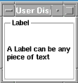
To show a fixed (hard coded) label, in the Widget Properties dialog box, after selecting Label, select Caption from the Options list. Then in the box titled Please Enter Text Value type, for example, A Label can be any piece of text and click OK. The caption option in the option in the list will now be displayed as
Caption (A Label can be any piece of text)
The displayed label will appear as shown above.
Variable Label
A variable containing the text can be generated by a macro which generates the text message or selects it from a list.
Select Track Variable and then type, for example, textString into the Variable box. Click the OK button directly underneath it.
The caption option in the option in the list will now be displayed as
Then click the bottom left OK button.
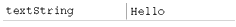
To display the message in textString it must be given a value. For demonstration purposes click the Model Variables tab and scroll down to the empty cells at the bottom of the table and add textString in the Name column, and "Hello" in the Value column.
Display the Label with its text "Hello" then select the Model Variables tab and edit the string "Hello" to "Goodbye". When you press Enter you will see the text in the widget change.
See Using the Properties Dialog Box.
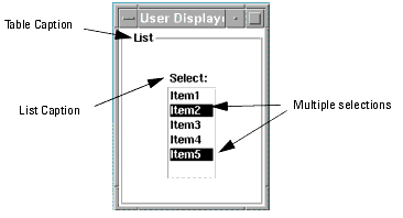
List
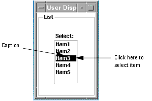
A List widget displays a permanent list of items which may be selected with the mouse. When an item is selected it remains selected after the mouse button is released.
The List may set up for single selection (like the Radio Buttons) or multiple selection where any number of items may be selected. In the Select Multiple Items mode clicking on selected items in the list will unselect them.
The List remains on display to show the selections.
To return a selection from a list select the option Selected Index. Click on Track Variable and then in the Variable box enter, for example, index.
The item selected will be listElems[index]. The variable name index, of course, must be declared, for example in the Model Variables table.
The Option specific to the List GUI item are:
See Using the Properties Dialog Box.
Page
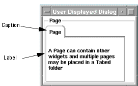
Pages are used in a Tabbed Folder. They are like tables whose caption shows up on a tab.
A Tabbed Folder is a stack of overlapping pages with non-overlapping tabs on each page. When a tab is selected its page comes to the top of the stack. See the Tab description.
A pages are added to a Tabbed Folder as a children by selecting the Tab item and then Add Child...
From the Widget Properties dialog select:
is used to set the caption on the tab of each page.
On each page you can add text (as a child) as a Label or as an Edit Text Box
On each page you can also add any combination of widgets.
The Option Allow Resize allows a page to grow dynamically with the text strings in the Labels in it. This allows arbitrary text strings generated or selected by a macro to be displayed.
See Using the Properties Dialog Box.
Allow Resize
Permits the page to dynamically resize to fit the string(s) of text.
Column Spacing
The integer value for the number of pixels between columns in a table.
Default Sizing Options for children
The sizing options for all members of the table if they don't declare their own sizing options.
Equalize All
When TRUE all widgets in a table are normalized to the same size. The default is FALSE.
Frame Visible
Indicates if a frame is to be visible or not. The default is FALSE.
Margin Height
The integer value for the number of pixels of margin at the top of the page.
Margin Width
The integer value for the number of pixels of margin at the sides of the page.
Number Rows/Columns
The integer value for the number of rows displayed for a horizontal orientation or the number of columns displayed for a vertical orientation. The children will be divided up evenly between the rows/columns.
Row Spacing
The integer value for the number of pixels between rows of a table.
Use Radio Behavior
When this is TRUE only one radio button in the table may be selected at a time.
Push Button
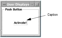
A Push Button is only active when while the cursor is over it and while the mouse button is depressed. Unlike the Check Box widget, the Push Button widget has no memory of being selected, and does not control any variable.
It operates by performing a callback, such as Button Pressed, whenever the button is pressed.
Typically, you will want to set Fix Width and Fix Height under Sizing options for buttons.
Button Caption
To show a fixed (hard coded) name for the button, in the Widget Properties dialog box, select Caption from the Options list. Then in the box titled Please Enter Text Value type, for example, Activate! and click OK. The caption in the options list will now be displayed as:
and the button will appear as shown above.
See Using the Properties Dialog Box.
Radio Box
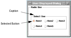
The Radio Box automatically creates and labels Radio Buttons according to the text strings stored in the array identified by the Entries Option.
Radio Buttons act as a group with all other radio buttons in a given Table. A group of radio buttons in a table is very similar to the Radio Box, but placing radio buttons in a table gives you more flexibility in the button placement. Radio buttons in a table can also provide a `multiple selection' radio box. The Option Radio Box Behavior on the parent table sets this mode. If Radio Button Behavior is true, all radio button's siblings in a table will act just like radio box (single selection). If Radio Button Behavior is FALSE the buttons behave like Check Boxes and allow multiple selections as show above right.
The items selected by a group of radio buttons are stored in an ICCAP_ARRAY.
The Option Selected Index allows you to assign a variable which takes the index value of the selected item n the ICCAP_ARRAY.
The array and index variables must be declared and defined in a variables table, for example in the Model Variables Table.
See Using the Properties Dialog Box.
Desensitized Indices
This is a list of 1's or 0's in an ICCAP_ARRAY to indicate which buttons in a Radio Box are insensitive.
Number Rows/Columns
The integer value for the number of rows displayed for a horizontal orientation or the number of columns displayed for a vertical orientation. The children will be divided up evenly between the rows/columns.
Orientation
Indicates the orientation of the items: Horizontal or Vertical.
Selected Index
The index number of the selected item.
Radio Button
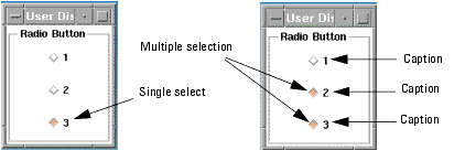
Radio buttons are always used in groups.
The default behavior when placed in a Table is Radio Button Behavior in which only one button can be selected at a time. When an unselected button is selected the previously selected button automatically becomes unselected. The selected one remains visually different to show the last selection, as shown above left.
When the Table Option Radio Button Behavior is set to FALSE the buttons behave like Check boxes and allow multiple sections as shown above right.
Toggle State
Toggles a value between 1 and 0 each time the box is checked.
The Radio Box widget automatically creates its own buttons which are ROUND. The Radio Button widget is a DIAMOND shaped button.
Note
See Using the Properties Dialog Box.
Scroll Table
Tables are used to organize the placement of widgets into a hierarchy of rows and columns, and are usually the first item to be defined in a GUI. The default orientation is vertical.
When widgets are added as children to a vertical table they will be placed one above the other in the same order as listed in the hierarchy in the Model GUI Items page. Horizontal tables may also be added as children to vertical tables.
Scroll tables are like normal tables except the table requires scrollbars to access table entries beyond the values set by Columns Visible and Visible Rows unless the rest of the dialog can accommodate more space. Setting Columns Visible and Visible Rows to 0 allows the table to shrink smaller than the first entry in the table and scrollbars will be shown to see the entire first entry.
Allow Resize
Permits items in the table to dynamically resize themselves and force the entire dialog to resize to accommodate the change.
Column Spacing
The integer value for the number of pixels between columns in a table.
Columns Visible
The integer value for the number of columns of widgets to show before scrollbars appear.
Default Sizing Options for children
The sizing options for all members of the table if they don't declare their own sizing options.
Equalize All
When TRUE all widgets in a table are normalized to the same size. The default is FALSE.
Frame Visible
Indicates if a frame is to be visible or not. The default is FALSE.
Margin Height
The integer value for the number of pixels of margin at the top of the table.
Margin Width
The integer value for the number of pixels of margin at the sides of the table.
Number Rows/Columns
The integer value for the number of rows displayed for a horizontal orientation or the number of columns displayed for a vertical orientation. The children will be divided up evenly between the rows/columns.
Row Spacing
The integer value for the number of pixels between rows of a table.
Use Radio Behavior
When this is TRUE only one radio button in the table may be selected at a time.
Visible Rows
The integer value for the number of rows of widgets to show before scrollbars appear.
Separator
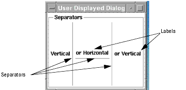
Separators are purely for cosmetic use and do not handle data.
As a GUI develops and contains more and more widgets the use of horizontal and/or vertical separators helps to keep the widgets and associated text visually organized.
Their positions are determined by the position in the list of siblings.
Length
The integer value for the length (in pixels) of the separator.
See Using the Properties Dialog Box.
Slider
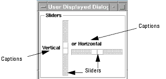
The Slider is an input in which the slider button is selected and dragged by holding down the left mouse button while it is moved. It has the advantage avoiding typing, and it is faster than the spin box.
The Option Current Value specifies the slider position as a integer, and a range may be established with the Minimum Value and Maximum Value options. The default range is 0 to 100.
Slider Moved—Name the Macro/Transform to be executed when the button is released after a slider has been moved.
Slider Moving—Name the Macro/Transform to be executed while the slider is being moved via the UI.
Variable Changed—Name the Macro/Transform to be executed whenever the specified variable/parameter changes.
See Using the Properties Dialog Box.
Current Position
The current position of the slider
Maximum Value
The maximum allowed value of the position
Minimum Value
The minimum allowed value of the position
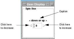
Spin Box
See Using the Properties Dialog Box.
The Spin Box allows you to change a value by clicking on the increment or decrement buttons. The advantage is that no typing is required. A minimum and maximum value can be set so as to keep the number in a useful (predetermined) range.
Scroll down the Options list and select Spin Type.
The choices are Spin Integer (default), Spin Real, Spin Text.
Integer Values
The default Spin Box controls an integer in increments of 1, with minimum and maximum values of 0 and 100.
The Options Maximum Value, and Minimum Value are only used for Spin Integer.
For the Option Spin Position set Track Variable on and assign a variable to indicate the position.
Real Values
Set the Spin Type to Spin Real.
For the Option Spin Real set Track Variable on and assign a variable to indicate the position. The Option Delta Between Real Steps must be set to a finite value. It is used only for real values.
Text Values
Set the Spin Type to Spin Text
Select the Option Items and enter the name of an ICCAP_ARRAY to hold the text strings to be displayed. Items is used only for text strings.
Spin Box Wraps
When set to TRUE (the default) any attempt to increase the value past the maximum will cause it to go to the minimum value, and vice versa. When the limit is reached the appropriate arrow changes from white to grey.
When set to FALSE the value increases to the specified maximum and stays there. The arrow changes from white to gray (insensitive) to indicate the value has hit the limit.
Split Arrows
This is a styling feature. When set to TRUE the up and down arrows appear on opposite sides of the value display box. On FALSE the will both be to the right.
See Using the Properties Dialog Box.
Columns
The integer value for the number of columns shown.
Delta Between Real Steps
Indicates the delta between steps when the spin box is in real mode.
Editable
Controls whether the edit field can be modified by the user.
Maximum Value
Indicates the maximum value.
Minimum Value
Indicates the minimum value.
Real Value
This is the real value of a spin box when the mode is set to real numbers.
Spin Box Wraps
Indicates whether a spin box should wrap around when it hits its minimum/maximum value.
Spin Position
Indicates where the Spinbox is.
Spin Type
Items is only used for Spin Text.
Maximum Value, Minimum Value are only used for Spin Integer.
Real Value, Delta Between Real Steps are only used for Spin Real.
Split Arrows
Indicates whether the arrows should be split.
Spreadsheet Table
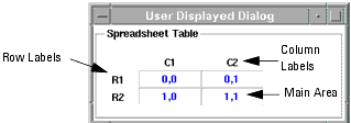
The Spreadsheet Table is an array of rows and columns of edit fields. It is much faster and more manageable than a table with the same number of Edit Text items in it, but is more restrictive in that it is always regular in shape.
It is usually needed only for very large data in very regular structures. The children will normally be Edit Text boxes.
The Spreadsheet Table, with its 46 Options, is the most complex of the widgets. It has three main regions (see Figure above):
| • | Main area which is an array of cells in rows and columns. |
| • | Space for the column labels. |
| • | Space for the row labels. |
The Spreadsheet Table displays a two-dimensional array of data from an ICCAP_ARRAY. The spreadsheet will be automatically sized. The primary index is the number of columns and the secondary index is the number of rows.
The name of the ICCAP_ARRAY is specified with Widget Properties > Options > Entries.
The iccap_array is actually a linear array of linear arrays.
In the Editing: Entries dialog box select the editing box and enter the name of the array of data for the cells, and click on the OK button directly underneath it.
The Option Label Type is typically set to Row and Column Labels. The labels for the rows and columns are set in ICCAP_ARRAY(s) which are named using the Widget Properties > Options. Select: Row Label Entries and Column Label Entries respectively and specify the names of ICCAP_ARRRAYS holding the row and column labels.
The Spreadsheet Table may also be used as an input device by setting the option Main Area Cells Editable to TRUE.
See Using the Properties Dialog Box.
Main Area Options
The 2-Dimensional Array Area.
Entries
Specifies an ICCAP_ARRAY two dimensional array of entries to show up in the spreadsheet.
Main Area Background Color
Indicates the background color that should be used in the main area of the spreadsheet.
Main Area Cell Alignment
This resource indicates how the values should be aligned within the cells of the main area of the spreadsheet.
Main Area Cells Editable
This resource indicates If the cells should be editable in the main area of the spreadsheet.
Main Area Cells Traversable
This resource indicates if focus should move with the keyboard in the main area of the spreadsheet.
Main Area Foreground Color
Indicates the foreground color that should be used in the main area of the spreadsheet.
Main Area Grid Type
Indicates if gridlines should be used in the main area of the spreadsheet.
Repaint
Specify a Variable Table Variable which when set to 0 allows you to make extensive modifications to the entries in the table without the visual changes.
Resetting the variable to 1 will repaint the whole graph with the new values in place.
Resize Rule
Specifies the resize rule: No Resize, Horizontal Resize, Vertical Resize, or Horizontal and Vertical Resize. Affects every cell in the table.
Label Type
Specifies the label type. The default is No Labels. If defining Column Label Entries, set Label Type to Column Labels or Row And Column Labels. If defining Row Label Entries, set Label Type to Row Labels or Row And Column Labels.
Column Area Options
The Column Label Area.
Column Label Entries
Specifies an ICCAP_ARRAY one dimensional array of labels to show up in the column headers. If you specify Column Labels, you must also set Label Type to either Column Labels or Row And Column Labels in order for the spreadsheet to display properly.
Column Label Cell Alignment
This resource indicates how the values should be aligned within the cells of the main area of the spreadsheet.
Column Label Area Cells Traversable
This resource indicates if focus should move with the keyboard in the Column Label area of the spreadsheet
Column Label Area Row Height
Indicates the height of the spreadsheet column headers.
Column Label Background Color
Indicates the background color that should be used in the column label area of the spreadsheet.
Column Label Foreground Color
indicates the foreground color that should be used in the column label area of the spreadsheet.
Column Label Grid Type
Indicates if gridlines should be used in the column label area of the spreadsheet.
Row Area Options
The Row Label Area.
Row Label Entries
Specifies an ICCAP_ARRAY one dimensional array of labels to show up in the row headers. If you specify Row Labels, you must also set Label Type to either Row Labels or Row And Column Labels in order for the spreadsheet to display properly.
Row Label Area Cells Traversable
This resource indicates if focus should move with the keyboard in the Row Label area of the spreadsheet.
Row Label Area Column Width
Indicates the width of the spreadsheet row headers.
Row Label Background Color
Indicates the background color that should be used in the row label area of the spreadsheet.
Row Label Foreground Color
Indicates the foreground color that should be used in the row label area of the spreadsheet.
Row Label Grid Type
Indicates if gridlines should be used in the row label area of the spreadsheet.
Column by Column Options
Set each column individually.
Column Background Colors
Set to 0 for <None Specified>.
Set to 1 for Default Color.
Set to 2 for Black.
Set to 3 for Red ...
See Color Table.
Column Cell Alignments
This is an ICCAP_ARRAY of attribute codes, one for each column. Press 'Show Codes' and see 'Main Area Cell Alignment' for valid entries. It is used to set the alignment type attribute individually for each column.
Column Grid Types
Set to 1 for No Grid.
Set to 2 for Horizontal Grid.
Set to 3 for Vertical Grid.
Set to 4 for Horizontal And Vertical Grid.
Columns Editable
This has values set to -1, 0, or 1 which indicate whether the corresponding column of the spreadsheet should be editable.
-1 indicates that the cell should be whatever is set by Main Area Cells Editable, 0 means not editable, and 1 means editable.
Column Foreground Colors
This is an ICCAP_ARRAY of attributes, one for each column. It is used to set the foreground color individually for each column. Note, indicating <none specified> means use what is in 'Main Area Foreground Color' if specified. Press 'Show Codes' and see 'Main Area Foreground Color' for valid values for the array entries.
Columns Traversable
This is an IC-CAP Array that of values set to 0 or 1 which indicates whether the corresponding column of the spreadsheet is to be traversable or not.
Column Width
This is an ICCAP_ARRAY-- one element for each column. Each entry determines the width of that column of the cell. Each entry should be an integer between 1 and 200. These values will not be changed if the user resizes a column.
Row by Row Options
Set each row individually.
Row Area Cell Alignment
This resource indicates how the values should be aligned within the cells of the main area of the spreadsheet.
Row Background Colors
Set to 0 for <None Specified>.
Set to 1 for Default Color.
Set to 2 for Black.
Set to 3 for Red ...
See Color Table.
Row Cell Alignments
Set to 0 for <None Specified>.
Set to 1 for Left Alignment.
Set to 2 for Right Alignment.
Set to 3 for Center Alignment.
Row Foreground Colors
Set to 0 for <None Specified>.
Set to 1 for Default Color.
Set to 2 for Black.
Set to 3 for Red ...
See Color Table.
Row Grid Types
Set to 1 for No Grid.
Set to 2 for Horizontal Grid.
Set to 3 for Vertical Grid.
Set to 4 for Horizontal And Vertical Grid.
Row Height
This is an ICCAP_ARRAY-- one element for each row. Each entry determines the height of that row of the cell. Each entry should be an integer between 1 and 20. These values will not change if the user resizes a row.
Row Span
Indicates how many rows this widget should span in a table. Note, a dummy table must be placed at the cell(s) of the table that will be overlapped.
Rows Editable
This has values set to -1, 0, or 1 which indicate whether the corresponding row of the spreadsheet should be editable.
-1 indicates that the cell should be whatever is set by Main Area Cells Editable, 0 means not editable, and 1 means editable.
Rows Traversable
This is an IC-CAP Array that of values set to 0 or 1 which indicates whether the corresponding row of the spreadsheet is to be traversable or not.
See Using the Properties Dialog Box.
Color Table
Set to D for <None Specified>
Set to C0 for Default Color
Set to C1 for Black
Set to C2 for Red
Set to C3 for Yellow
Set to C4 for GREEN
Set to C5 for CYAN
Set to C6 for BLUE
Set to C7 for MAGENTA
Set to C8 for GRAY
Set to C9 for WHITE
Set to C10 for MEDIUM BLUE
Set to C11 for DARK_SLATE_GRAY
Set to C12 for DIM_GREY
Set to C13 for SLATE_GREY
Set to C14 for MIDNIGHT_BLUE
Set to C15 for NAVY_BLUE
Set to C16 for DARK_SLATE_BLUE
Set to C17 for SLATE_BLUE
Set to C18 for MEDIUM_SLATE_BLUE
Set to C19 for ROYAL_BLUE
Set to C20 for DODGER_BLUE
Set to C21 for STEEL_BLUE
Set to C22 for DARK_GREEN
Set to C23 for DARK_OLIVE_GREEN
Set to C24 for SEA_GREEN
Set to C25 for FOREST_GREEN
Set to C26 for OLIVE_DRAB
Set to C27 for INDIAN_RED
Set to C28 for SADDLE_BROWN
Set to C29 for SIENNA
Set to C30 for FIRE_BRICK
Set to C31 for BROWN
Set to C32 for ORANGE_RED
Set to C33 for DEEP_PINK
Set to C34 for MAROON
Set to C35 for MEDIUM_VIOLET_REDSet to C36 for VIOLET_RED
Set to C37 for DARK_ORCHID
Set to C38 for SNOW1
Set to C39 for SNOW2
Set to C40 for ANTIQUE_WHITE1
Set to C41 for LEMON_CHIFFON1
Set to C42 for IVORY1
Set to C43 for HONEYDEW1
Set to C44 for LAVENDER_BLUSH1
Set to C45 for LAVENDER_BLUSH2
Set to C46 for MISTY_ROSE1
Set to C47 for MISTY_ROSE2
Set to C48 for AZURE1
Set to C50 for AZURE2
Set to C51 for DODGER_BLUE2
Set to C52 for STEEL_BLUE1
Set to C53 for DEEP_SKY_BLUE1
Set to C54 for SKY_BLUE_1
Set to C55 for LIGHT_SKY_BLUE1
Set to C56 for SLATE_GRAY2
Set to C57 for LIGHT_STEEL_BLUE1
Set to C58 for LIGHT_BLUE1
Set to C60 for LIGHT_CYAN1
Set to C61 for PALE_TURQUOISE1
Set to C62 for CADET_BLUE
Set to C63 for CADET_BLUE2
Set to C64 for TURQUOISE1
Set to C65 for CYAN1
Set to C66 for DARK_SLATE_GRAY1
Set to C67 for AQUAMARINE2
Set to C68 for DARK_SEA_GREEN1
Set to C69 for DARK_SEA_GREEN2
Set to C70 for SEA_GREEN1
Set to C71 for PALE_GREEN1
Set to C72 for SPRING_GREEN1
Set to C73 for GREEN1
Set to C74 for CHARTREUSE1
Set to C75 for OLIVE_DRAB1
Set to C76 for DARK_OLIVE_GREEN1
Set to C77 for KHAKI1
Set to C78 for LIGHT_GOLDENROD1
Set to C79 for YELLOW1
Set to C80for GOLD1
Set to C81 for GOLDENROD1
Set to C82 for SIENNA2
Set to C83 for WHEAT2
Set to C84 for CHOCOLATE1
Set to C85 for BROWN1
Set to C86 for LIGHT_SALMON1
Set to C87 for ORANGE1
Set to C88 for CORAL2
Set to C89 for RED2Set to C90 for DEEP_PINK1
Set to C91 for HOT_PINK1
Set to C92 for PINK1
Set to C93 for LIGHT_PINK1
Set to C94 for PALE_VIOLET_RED1
Set to C95 for MAROON1
Set to C96 for VIOLET_RED1
Set to C97 for MAGENTA1
Set to C98 for ORCHID1
Set to C99 for PLUM1
Set to C100 for THISTLE1
Set to C101 for GRAY52
Set to C102 for GRAY62
Set to C103 for GRAY72
Set to C104 for GRAY82
(Tab) Tabbed Folder
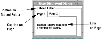
The GUI Item Tab creates a folder of overlapping pages with non-overlapping tabs on each page. When a tab is selected, its page comes to the top of the stack.
Properties > Tab > Options > Caption
Pages are added as children to the Tabbed folder using
Add Child... > Widget Properties > Select Type > Page
The caption on the tab of each page is set with Tab > Caption.
On each page you can add (as a child) unlimited text (including carriage returns) as
| • | A Label which will produce read-only (uneditable) text |
| • | An Edit Text Box which produces editable text in a scrolling Edit Text box. |
On UNIX platforms, some widgets on Tabbed-folder pages may not appear properly. To avoid this potential problem, place your content within a single Table widget (it can have 0 margin width and 0 margin height) inside the page. For example, instead of placing 4 widgets on a page, place a single table on a page, then place the 4 widgets inside the table.
On Window platforms, you should also place your content within a single Table widget inside the page just in case the mdl is ever used on a UNIX platform.
Note
Any combination of widgets can also be entered on a page so as to produce a folder of GUIs.
Note
Current Page
Indicates the initial page to display when an integer is set. If tracking a variable, the variable is updated with each page change to reflect the currently selected page.
Frame Visible
Indicates if a frame is to be visible or not. The default is FALSE.
Margin Height
The integer value for the number of pixels of margin at the top of the table.
Margin Width
The integer value for the number of pixels of margin at the sides of the table.
Page Change OK
Set to 1 just before a page change. The Page Validation callback is then invoked. If you set this option to track a variable, you may set it to 0 during the Page Validation callback to prevent a page change.
Invoked whenever the current page is changed. If you track the Current Page with a variable, the variable will have the new page in the callback.
Invoked before a page is changed. Prior to invocation, Page Change OK is set to 1 if a variable is being tracked. Set this variable to 0 during the callback if the page change should not occur.
See Using the Properties Dialog Box.
Table
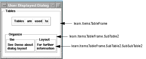
Tables are used to organize the placement of widgets into a hierarchy of rows and columns, and are usually the first item to be defined in a GUI. The default orientation is vertical.
When widgets are added as children to a vertical table they will be placed one above the other in the same order as listed in the hierarchy in the Model GUI Items page. Horizontal tables may also be added as children to vertical tables.
Widgets are then added as children in the horizontal tables. Tables may be nested within other tables without limit to organize a complex hierarch of input and output devices.
See tutorial More on Tables (Examples).
The Diode Extraction Demonstration is a good example.
Allow Resize
Permits items in a Table to dynamically resize themselves and force the entire dialog to resize to accommodate the change. Note that all tables in the hierarchy must be set to Allow Resize for the resizing to propagate all the way to the main dialog.
Default Sizing Options for children
The sizing options for all members of the table if they don't declare their own sizing options.
Equalize All
When TRUE all widgets in a table are normalized to the same size. The default is FALSE.
Frame Visible
Indicates if a frame is to be visible of not. The default is FALSE unless there is a Caption.
Margin Height and Margin Width
The integer value for the number of pixels of margin at the sides and top of the table.
Number Rows/Columns
The integer value for the number of rows displayed for a horizontal orientation or the number of columns displayed for a vertical orientation. The children will be divided up evenly between the rows/columns.
Row and Column Spacing
Indicates how many pixels of spacing between rows or columns.
Use Radio Behavior
When this is TRUE only one radio button in the table may be selected at a time.