Print version of this Book (PDF file)
The Widget Properties Dialog Box
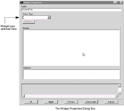
The Widget Properties Dialog Box is launched
| • | when the Add... or Add Child... buttons are selected. |
| • | when the Properties button is selected. |
| • | when a widget in the right window is double-clicked. |
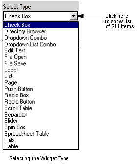
The top level item in this box is the Select Type box. Press the activate button on the right side of it. A dropdown menu appears offering sixteen choices of widgets.
Widget Classes
The available widgets perform four general functions: organizing placement, handling single variables, and handling lists.
Widget Naming
Once the widget type has been chosen it can be named in the top box of the Widget Properties dialog box. This is not essential but it is very desirable since it makes the widget map (as distinct from the GUI itself) much more intelligible.
Using the Properties Dialog Box
Once the widget type has been selected and named it is mandatory that it be assigned a variable to modify and/or a function to call if the widget is to handle input or output.
Once a widget type has been selected, the left side of the properties box shows a list of the Options and a list of Callbacks available for this widget.
Select, for example, the option Caption.
| • | The information box at the bottom will show relevant information. |
| • | The title of the right side editing area changes to Editing: Caption. |
| 1 | Click on the box titled Please Enter Text Value and enter the text for the caption, e.g "Start". Do not use the enter key unless you are entering multi-line captions. |
| 2 | Click on the OK or Apply button immediately below. In the Options list Caption will be shown as Caption (Start). |
| 1 | In the Editing: Caption box set Track Variable to on (so that an x shows in the box). |
| 2 | Click on the box titled Variable and enter the variable name, e.g. buttonName. |
| 3 | Then click on the OK or Apply button immediately below. In the Options list Caption will be shown as Caption (Variable buttonName). |
| 4 | The variable buttonName must be declared in a variable table, e.g. the Model Variable table accessed by clicking on the Model Variables tab. |
For the GUI to accept the information from the Widget Properties dialog box, click on either the OK or the Apply buttons at the bottom left corner. OK dismisses the dialog box, while Apply leaves it in place.