Creating an IC-CAP Plot
This section contains procedures for definition and creation of graphic displays and textual reports. The MOSFET model supplied with IC-CAP, nmos2, contains a variety of plotted data sets and is used as the example in this chapter.
A plot is a graphical representation of data that gives a quick view of measured and simulated data, making it easier to spot any differences between the two. Using IC-CAP's plot analysis features, you can identify a data point or slope of a curve easily.
If you need to get raw data in the form of numbers rather than a graph, you can view such data in a list form that can be sent to a printer.
The general procedure for creating a plot is:
| • |
Open the setup and add a plot. |
| • |
Assign a data set to a graph axis. |
| • |
Specify a report type and an axis type. |
| • |
Put in a header and footer if necessary. |
| • |
Rescale the plot if necessary. |
| • |
Print a hardcopy of the plot. |
Because the print methods vary significantly between UNIX and the PC, this chapter describes printing from these platforms separately. See the appropriate section for your platform:
Adding a New Plot
The first step in creating a plot is to add a plot.
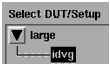
To create a new plot:
| 1 |
In the DUTs-Setups folder, select the setup. |
| 4 |
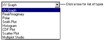
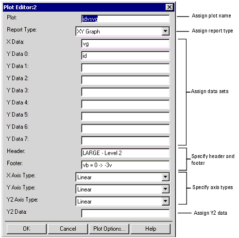
In the Plot Editor, enter a name for the new plot. |
| 5 |
Select one of the Report Types from the drop-down list. |
|
Note
|
|
|
|
|
You can specify an alternate name for a plot legend by adding two exclamation marks (!!) followed by the alternate name after the real data item. For example, the following statements label the X data as vin and the Y data as calc_a:
 X Data : /a/really/really_long_path/vin !! vin
 Y Data 0 : (a + complicated)*expression !! calc_a
|
|
| 8 |
Click OK. The new plot is added to the Plots folder. |
Defining a Plot for Specific Data
The following 8 tables list definitions for plot data types. Certain plot characteristics can be set with system variables. When a variable applies to a specific plot type, the variable is listed in the table for that type. Variables that apply to any plot are listed in Table 46.
Table 38 Defining a Plot for XY Data
|
|
X Data:
|
The Input name
|
Y Data 0:
|
The Output name (or expression that is a function of the outputs)
|
Y Data 1-7:
|
Names of additional outputs sharing the same scale as Y0
|
Header:
|
Annotation that appears above the graph
|
Footer:
|
Annotation that appears below the graph
|
X Axis Type:
|
X Axis Type (Linear, Log 10, and dB) †
|
Y Axis Type:
|
Y Axis Type (Linear, Log 10, and dB) †
|
Y2 Axis Type:
|
Additional Y axis type used for showing another data set with a different magnitude or domain. For example, use the Y axis for gain and the Y2 axis for phase.
|
Y2 Data:
|
The name of a data set to display with a different scale.
|
† dB axis type represents 20 × log10(x), not 10 × log10(x).
|
Table 39 Defining a Plot for Real/Imaginary Data
|
|
Sweep Data:
|
The Input data set name
|
RI Data 0:
|
The Output data set name or expression that is a function of the outputs
|
RI Data 1-7:
|
Additional data sets or expressions
|
Header:
|
Annotation that appears above the graph
|
Footer:
|
Annotation that appears below the graph
|
Table 40 Defining a Polar Chart
|
|
Sweep Data:
|
The Input data set name
|
Polar Data 0:
|
The Output data set name or expression that is a function of the outputs
|
Polar Data 1-7:
|
Additional data sets or expressions
|
Header:
|
Annotation that appears above the graph
|
Footer:
|
Annotation that appears below the graph
|
Table 41 Defining a Smith Plot
|
|
Sweep Data:
|
The Input data set name
|
Smith Data 0:
|
The Output data set name or expression that is a function of the outputs
|
Smith Data 1-7:
|
Additional data sets or expressions
|
Header:
|
Annotation that appears above the graph
|
Footer:
|
Annotation that appears below the graph
|
A histogram depicts either the frequency or the relative frequency of data distribution. Typically a histogram is used to identify both the ranges around which most of the data converges and the outliers of the data set. In a histogram, the X-axis displays the value ranges while the Y-axis plots the frequency or relative frequency for each range. A histogram is used for the visualization of data for a single variable.
Table 42 Defining a Histogram
Data Type
|
Definition
|
Data-set:
|
The Input data set name
|
Header:
|
Annotation that appears above the graph
|
Footer:
|
Annotation that appears below the graph
|
Variables for setting Plot Characteristics
|
|
HISTOGRAM_NUM_BINS
|
Number of bins in the histogram plot. Default is 10.
|
HISTOGRAM_NORMALIZATION
|
Can be set to either TRUE or FALSE. Setting it to TRUE will normalize the histogram. Default is TRUE.
NOTE: definition of the histogram normalization:
Assume
Variable X indicated the width of the
histogram bin,
Variable n indicated the number of the
histogram bins.
Variable Yi indicated the number of
samples for the histogram bin with
index of i
Variable normalize_Yi indicated the
normalized number of samples for the
histogram bin with index of i
Then we have, 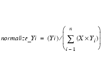
|
HISTOGRAM_GAUSSIAN_FIT
|
Can be set to either TRUE or FALSE. Setting it to TRUE will draw the Gaussian curve fitted to the histogram. Default is TRUE.
|
A cumulative density plot depicts either the cumulative frequency or the cumulative relative frequency of data distribution. Typically a cumulative density plot is used to track variations between contemporaneous observations by highlighting changes in mean levels. In a cumulative density plot the X-axis displays the value ranges while the Y-axis plots the cumulative frequency or cumulative relative frequency for each range.
Table 43 Defining a CDF Plot
Data Type
|
Definition
|
Data-set:
|
The name of an Input data set
|
Header:
|
Annotation that appears above the graph
|
Footer:
|
Annotation that appears below the graph
|
Variable for setting Plot Characteristics
|
CDF_ERROR_FIT
|
Can be set to TRUE or FALSE. TRUE will draw the Gaussian curve fitted to the Cumulative plot. Default is TRUE.
|
A scatter plot depicts the distribution of pairs of values on a rectangular, 2-dimensional plane. A scatter plot is the most effective method of analyzing the correlation between two variables. Values for one variable are tracked on the X-axis while values for the other variable are tracked on the Y-axis.
Table 44 Defining a Scatter Plot
Data Type
|
Definition
|
X Data:
|
The X-axis parameter name
|
Y Data:
|
The Y-axis parameter name
|
Header:
|
Annotation that appears above the graph
|
Footer:
|
Annotation that appears below the graph
|
X Axis Type:
|
X Axis Type (Linear, Log 10, and DB)
|
Y Axis Type:
|
Y Axis Type (Linear, Log 10, and DB)
|
Variable for setting Plot Characteristics
|
|
SCATTER_CONTOURS
|
Can be set to either TRUE or FALSE. Setting it to TRUE will draw the contours. Default is TRUE.
|
SCATTER_NUM_SEGMENTS
|
Number of segments used in drawing the contours of the plot. Default is 1500. Using a larger number results in an accurate contour, but takes more time.
|
Table 45 Defining a Multiplot Studio
|
|
# of Plots
|
Number of plots displayed in the Multiplot. The number can be from 1 to 100. The default is 4.
|
Plot 1 - 100:
|
Name of each plot.
|
# of GUIs:
|
Number of GUI regions. The number can be 0 to 8. The default is 0.
|
GUI 1 - 8:
|
Name of each GUI region.
|
GUI 1- 8 Location:
|
Location on the Multiplot display for each GUI region. The location can be upper left (UL), upper right (UR), upper (U), left (L), right (R), bottom left (BL), bottom right (BR), or bottom (B).
|
Orientation:
|
Orientation of the Multiplot. The orientation can be vertical (V) or horizontal (H). The default is horizontal.
|
Plots Per Row:
|
Number of plots in each row. If the number is 0, the plots will be arranged so that the number of rows and columns are equal if possible (squared layout). The default is 0.
|
Variable for setting Plot Characteristics
|
|
DYNAMIC_MULTIPLOT_MODE
|
Sets the location where the manual scaling setting is saved for a Multiplot. If set to FALSE, the manual scaling setting for each subplot in a Multiplot is saved with the Multiplot, allowing different scaling to be saved for the same plot if opened as a single plot or on one or more Multiplot. If set to TRUE, the manual scaling setting for each subplot in a Mulitplot is saved with the subplot. In this mode, no matter where the plot is opened (as a single plot or on one or more Multiplots), it will use the same scaling information. However, if the same subplot appears on multiple Multiplots, or in multiple positions of the same Multiplot, then the settings for only the last subplot closed is saved. Default is FALSE.
|
Table 46 Plot Characteristics Variables
|
|
ANNOTATE_AUTO
|
Sets a flag to enable or disable automatic annotation update upon data changes. Default is No.
|
ANNOTATE_CSET
|
Sets a Starbase character set to be used for annotation texts. Default value is determined by
/usr/lib/starbase/defaults.
|
ANNOTATE_FILE
|
Sets a file name from which a plot reads in an annotation text. Default is no file to read.
|
ANNOTATE_MACRO
|
Sets a macro name that is executed by a Plot for generating an annotation text. Default is no macro to execute.
|
CHECK_PLOT_MATCH
|
Lets IC-CAP check if a given XY pair belongs to the same Setup. If No, potentially mismatched XY pair can be shown in a tabular format with Display Data. Default is Yes.
|
DASH_DOT
|
Sets the number of data points at which a simulated line changes from a dashed to a dotted line. Used in Plot. Default value is 32.
|
FIX_PLOT_SIZE
|
If Yes, Plot windows open using the size specified by GWINDX and GWINDY. If No, they open using the last displayed size. Default is No.
|
GWINDX
|
Sets the initial Plot window horizontal size in 1/100mm. Used in Plot. Default value is 12500.
|
GWINDY
|
Sets the initial Plot window vertical size in 1/100mm. Used in Plot. Default value is 9000.
|
IGNORE_PLOT_LOC
|
If Yes, Plot windows open using the X windows system configuration. If No, they open using the last displayed location. Default is No.
|
MINLOG
|
Can be set to a real value. Defines the value to be used in a LOG plot, if data point value is zero or negative. Default is 10e-18.
|
OFFSCREEN_PLOT_LINE_ WIDTH
|
Sets the line thickness used when drawing a plot to an HPGL file or HPGL printer. OFFSCREEN_PLOT_TRACE_LINE_WIDTH will override this value for the traces on a plot. Default is 0.
|
OFFSCREEN_PLOT_TRACE_LINE_WIDTH
|
Sets the line thickness used when drawing the traces of a plot to an HPGL file or HPGL printer. Default is 0.
|
PLOT_LINE_WIDTH
|
Sets the line thickness used when drawing a plot. PLOT_TRACE_LINE_WIDTH will override this value for the traces on a plot. Default is 1.
|
PLOT_TRACE_LINE
|
Sets whether trace line is drawn or not. If defined as Yes, the trace lines are drawn. If defined as No, the trace lines will not be drawn, and instead markers will be drawn. Default is Yes.
|
PLOT_TRACE_LINE_WIDTH
|
Sets the line thickness used when drawing the traces of a plot. PLOT_TRACE_LINE_WIDTH will override this value for the traces on a plot. Default is 1.
|
RETAIN_PLOT
|
When Yes and Auto Scale is off, plot is not erased when updated to allow overlay of curves if the X server has backing store capability. Default is No.
|
RI_GRAPH_SYMMETRY
|
When defined as Yes, the plot title is displayed. If defined as No, the plot title is not displayed. Default is Yes.
|
SHOW_GRID
|
When No, plot eliminates XY grids and leaves tics. Default is Yes.
|
USE_PLOT_LOOKUP
|
Lets IC-CAP perform auto-lookup of X data from each Y data. Another way to disable auto-lookup is to use an arbitrary expression for an X data. Default is Yes.
|
Editing a Plot
To edit an existing plot definition:
| |
• |
From the plot window, click Options > Edit Definition or right click on the plot then choose Edit Definition. |
| |
• |
From the DUTs-Setups folder, select the setup. Then select Plots. Now double-click the plot table you want to edit or select the plot table and click Edit. |
- Alternatively, you can edit directly in the plot table. See Table and Text Editors.
| 2 |
Change the fields as needed and click OK. The plot definition is updated. |
Notes:
| • |
If the plot window is open when you click OK, the plot window closes then immediately reopens with the new definition. The exception is if you were editing the definition of a sub-plot in a Multiplot window. In that case, the Multiplot window refreshes with the updated definition. If the selected plot was also displayed in a single plot, the single plot closes and does not reopen. |
| • |
In a Multiplot window, if you right click on a plot to open the Plot Editor and change the plot's name, when you click OK the plot disappears from the Multiplot window. |
Tips:
| • |
Use Display Plot to view the plot window for an individual, selected plot. |
| • |
Use Display All to view plot windows for all defined plots. |
| • |
Use Close All to close all open plot windows. |
| • |
For all plots except Multiplot, use View to see data in a tabular format. |
Defining Axis Types and Data Sets
In the example definition, both X axis and Y axis are defined as LINEAR. You can change this type to either LOG10 or DB. Although the example does not need to have a log Y axis, try changing it:
| 1 |
Select the example plot, idvsvg. Click Edit. |
| 2 |
In the Y Axis Type field, toggle to LOG10 and click OK. |
| 3 |
Click Display Plot to view the graph. The graph idvsvg is updated with a logarithmic Y axis. |
|
Note
|
|
|
|
|
The XY GRAPH is not a convenient means for viewing complex numbers. If you want to make a graph with complex numbers, use either the RI GRAPH or the POLAR GRAPH. These graphs take one sweep data set, such as frequency, and generate a Real/Imaginary graph or a Polar graph.
|
|
Y2 Data
Another Y axis, called Y2 data, is available for XY GRAPH. The Y2 data axis is useful for showing another data set with a different magnitude or domain. For example, in a gain and phase versus frequency graph you can use the Y axis for gain and the Y2 axis for phase. The Y2 axis always requires one or more Y data sets because a slope of a Diag Line is derived from the left axis values.
The program assumes that Y2 data shares the same setup with the X data, so the program never looks up the Y2 data and always draws against the X data in the plot definition.
Expression
An expression can be entered into the data set fields described above, just like any other fields where an expression is allowed. For example, you can enter a natural log of id as log(id) in the Y Data 0 field. The calculated data set belongs to the setup where this plot definition exists.
Multiple X Data
IC-CAP allows plots to have multiple XY pairs in a single graph by looking up the same X data name in another setup. This is useful when comparing multiple XY pairs with different X ranges.
Auto Lookup
Each Y data set is examined for its corresponding X data set. This feature, called Auto Lookup, takes the X data name from the plot definition and searches this name in the setup that has this particular Y data in question. If there is no such X data in that setup, then the X data in this plot definition is used.
For example, the next definition draws two different sets of id vs vg curves based on large and short setups so that one set represents id vs vg of nmos2/large/idvg setup while the other set shows that of nmos2/short/idvg. The Y data names do not have to be the same. This feature supports all the report types.
Table 47 Id vs Vg #1
|
|
X Data
|
/nmos2/large/idvg/vg
|
Y Data 0
|
/nmos2/large/idvg/id
|
Y Data 1
|
/nmos2/short/idvg/id
|
If this plot exists in the nmos2/large/idvg setup, then the next definition is good enough to show the same curves. In both cases, the number of data points and points per curve may vary among Y data sets because each Y data is shown against its corresponding X data from their home setup.
Table 48 Id vs Vg #2
|
|
X Data
|
vg
|
Y Data 0
|
id
|
Y Data 1
|
nmos2/short/idvg/id
|
The tabular report drops each Y data set that does not share the X data of the plot definition, because representing multiple, possibly independent X and Y data pairs in a simple 2-dimensional table is difficult.
For example, the plot definition in the second table shows the vg and id of nmos2/large/idvg setup only. When you must show all data sets that do not share the same X data, set the system variable CHECK_PLOT_MATCH to No.
Calculated Data
If an expression is entered into a plot definition, then the calculated result belongs to the setup where the plot definition exists. Therefore, when using a transform, you must calculate data within its home setup.
For example, the next definition based on the previous example gives the wrong curves for Y Data 1 because the id in the short setup is drawn against vg in the large setup. If the data size does not match between the X and Y data sets, the program issues an error message.
Table 49 Calculated Id
|
|
X Data
|
vg
|
Y Data 0
|
id
|
Y Data 1
|
nmos2/short/idvg/id*2
|
Disabling Lookup
You can disable the Auto Lookup so that all the Y data are drawn against the same X data even if these Y data sets do not belong to the same setup with the X data. To turn off the Auto Lookup set the system variable USE_PLOT_LOOKUP to No.
Displaying Raw Data
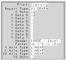
You can view the raw data for an input, output, transform, or plot (except Multiplot) by selecting it and clicking View (in their respective folders). The data format displays the data point number, data index, and the real and imaginary part of the data.
| • |
Point shows the number of sweep data point starting from 0 (zero). |
| • |
Index represents a pair of subscripts for a matrix data, such as S-parameters. These are in row, column format. |
The actual data points for an input, output, or transform are shown in real and imaginary format represented in the header by R and I.
The data format for plots follows the report type of the plot itself. When the report type is XY GRAPH only the real part of the data is displayed.
| • |
M indicates measured data and S indicates simulated data. |
| • |
C denotes common data that is shared between measurements and simulations (for example, an Input). |
The tabular data of a plot shows the Y data that belongs to the setup of this plot. Foreign Y data is not displayed because of the different X data. See Y2 Data.
Displaying Plots
You can open a plot window to view your measured and simulated data (see the following figures). The currently-defined graphs are listed in the Plots folder in each setup. You can open one or more plot windows at a time and each display appears in a separate window. For all plots except Multiplot, you can view the same data at the same time on a graph and in a tabular format.
Measured data is displayed as a solid line; simulated data is displayed as small squares by default. Plots are automatically updated each time a measurement or simulation is performed. After an extraction and subsequent simulation, you can view the plots for agreement between measured and simulated data.
| • |
To view the plot window: |
| |
• |
For an individual, selected plot, click Display Plot 
|
| |
• |
For all plots defined in a setup, click Display All 
|
| • |
To see data in a tabular format for all plots except Multiplot, click View. 
|
| • |
To close all open plot windows, click Close All. 
|
|
Note
|
|
|
|
|
Alternatively, you can display a plot by selecting a plot definition and clicking the right mouse button. Then choose an option from the menu.
If you want to display or close plots while a different folder is open, use the tool bar buttons at the top of the Model window: Display Plots (Setup), Close Plots (Setup), Display Plots (DUT), Close Plots (DUT).
|
|
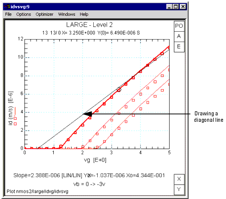
Area Tools
To display Area Tools, choose Options > Area Tools or right click then choose Graphic > Area Tools. The following figure shows a Plot window with Area Tools displayed.
Figure 36 Example Plot Window
|
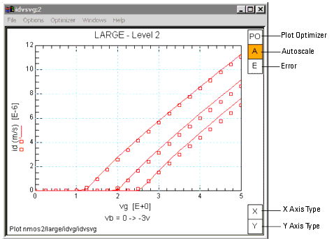
|
The PO (Plot Optimizer) area tool performs the same function as the Optimizer > Enable/Disable Plot menu pick. When enabled, the PO area tool is blue and the plot has a blue border. For additional information about the Plot Optimizer, see Chapter 8, "Using the Plot Optimizer."
The A (Autoscale) area tool performs the same function as the Options > Autoscale menu pick. See Scaling.
The E (Error) area tool performs the same function as the Options > Error menu pick. See Defining and Displaying Errors.
The X (X Axis Type) area tool enables you to toggle through the available X axis types from the plot window. To view the current selection, position and hold the cursor over the area.
The Y (Y Axis Type) area tool enables you to toggle through the available Y axis types from the plot window. To view the current selection, position and hold the cursor over the area.
The Y2 (Y2 Axis Type) area tool enables you to toggle through the available Y axis types from the plot window. This area tool is only shown when a Y2 trace is present.
Multiplot windows also have a Zoom area tool. The Zoom area tool enlarges the selected plot. A red border indicated which plot is selected. When Zoom is enabled, you can change which plot is enlarged simply by clicking on a different plot. In addition, the Plots menu enables you to zoom in or display a full page plot. Figure 38 shows a 2 plot Multiplot window with Zoom enabled.
Figure 37 Example Multiplot Window
|
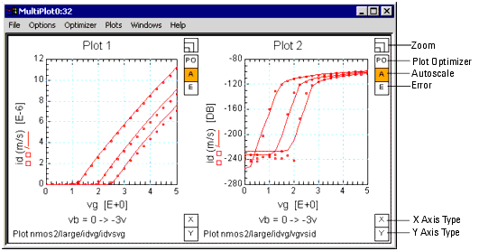
|
Figure 38 Example Zoomed Multiplot Window
|
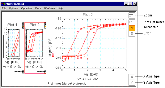
|
Scaling
Autoscale
Autoscale can be toggled on and off by either:
| • |
Choosing Options > Autoscale |
| • |
Right clicking on the plot then choosing Scaling > Autoscale |
| • |
Clicking the plot's A area tool. |
If a check mark is before the Autoscale menu item or the plot's A area tool is orange, Autoscale is on. When Autoscale is on, the axes will autoscale so all data is visible. When Autoscale is off, the state of this menu item is saved to .mdl files. For example, if you save a plot (or a model containing the plot) with Autoscale turned off, the plot retains the setting, and opens in the Autoscale OFF state the next time the plot is opened.
Axes scaling is controlled by settings you choose in the Manual Rescale dialog box (Options > Manual Rescale). If you have a new plot, or a plot that has never had the scaling modified, turning Autoscale off locks the current settings in place. Any future toggling of Autoscale ON/OFF will switch between full scale, and this remembered setting. The remembered setting can be further modified by using the Options > Manual Rescale or Options > Set Scale menu choices.
Rescale
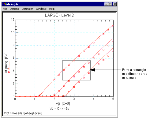
You can zoom into a selected area of a plot by drawing a box around a portion of the plot, then either:
| • |
Choose Options > Rescale |
| • |
Right click on the plot and choose Scaling > Rescale |
| • |
In a Multiplot window, select a plot then choose Plots > Selected Plot Menu > Scaling > Rescale |
Also, you can pan across the plot by selecting a single point on the plot then choose Rescale. The plot moves so the selected point is at the display's center. When Autoscale is on, the rescaling is temporary. The next replot restores the plot to full Autoscale.
Set Scale
The Options > Set Scale menu item is a shortcut to establish Manual Rescale settings. You can also access this menu item by right clicking on the plot then choosing Scale > Set scale or from a Multiplot window by first selecting a plot then choosing Plots > Selected Plot Menu > Scaling > Set scale. Whether you are in autoscale mode or had performed a Rescale to zoom in on a region of the plot, choosing Options > Set Scale sets the Manual Rescale dialog box to the plot's current scaling values (e.g., X min, X max, Y min, Y max, etc.).
Manual Rescale
The Manual rescale dialog box enables you to fully describe all three axes of XY plots in terms of minimum value, maximum value, number of major divisions, and number of minor divisions. You can access this dialog box by choosing Options > Manual rescale or right clicking on the plot then choosing Scaling > Manual rescale. In a Multiplot window, you can access this dialog by selecting a plot then choosing Plots > Selected Plot Menu > Scaling > Rescale.
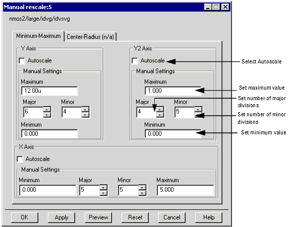
In addition
| • |
You may leave any of the three axes autoscaled if you like. |
| • |
You may scale the real and imaginary axes of RI plots as well. RI, Smith, and Polar plots can be centered around a specified point with a specified radius displayed. |
| • |
You may specify the number of major and minor divisions for RI and Polar plots, but not for Smith plots. |
Histogram and cumulative density plots permit scaling of the X axis and scatter plots permit scaling of the X and Y axes. Some requests may be denied due to algorithmic constraints, and in this case, the closest match is made updating the dialog with the actual values used. For example, LOG scaled axes are forced to the next decade, and the number of major and minor divisions are ignored. The number of major divisions in polar plots must be even.
Manual Rescale enables you to set the minimum to a specific value, such as .123, without rounding the value up or down. While this gives you much greater control, it can cause some problems with numbers overwriting each other, usually on the X axis. However, LOG scaled axes will still round up or down to the nearest decade.
Any settings established using Manual Rescale, the associated iccap_func command, or Options > Set Scale are saved with the plot in the .mdl file. To establish settings, choose OK or Apply. (OK also dismisses the dialog box.) To see what a plot looks like before establishing the current settings, choose Preview. To restore settings to the previously established ones, choose Reset or Cancel. To dismiss the dialog box, choose Cancel.
The settings in this dialog box update dynamically whenever a plot's scale changes. Scales change dynamically for various reasons, including when a simulation changes an autoscaled limit, or the Options > Rescale menu item is chosen. Updated settings do not change your established settings until you choose OK, Apply, or Options > Set Scale. Dynamic updating is convenient when you want to establish new settings.
Manual Rescale is fully controllable through PEL. To rescale a plot, use the iccap_func command for Plot:
-
iccap_func("Plot","<keyword>")
The allowed keywords include:
|
Note
|
|
|
|
|
The keywords Scale RI Plot Preview and Scale Plot Preview function in the same way as Scale RI Plot and Scale Plot, but the scaling will be lost on the next Replot command.
|
|
When the iccap_func command is used as shown above, prompts appear for the operator to enter required values for the parameters that describe the plot's scaling values. For additional information, see Scale Plot/Scale Plot Preview or Scale RI Plot/Scale RI Plot Preview in the Reference manual.
Marking a Point
You can identify the nearest data point on the graph and show its X and Y values and data point number by marking a point.
To mark a data point:
- Click the Left mouse button on the graph.
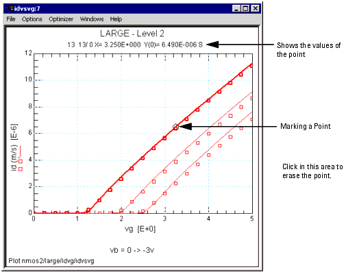
To erase the circle that marks the point:
- Click the Left mouse button in the graph window, but on the outside of the graph itself. This erases the circle that marks the point, as well as its data values.
The data point number has two digits separated by a slash. The number on the left of the slash represents the primary sweep point number (sweep order 1), and the number on the right shows the secondary sweep point number (sweep order 2). A data point on Y2 axis can not be identified.
Drawing a Diagonal Line
You can draw a diagonal line connecting two clicked points and its slope, with both X and Y axis intercepts.
To draw a diagonal line:
| 1 |
Click and drag the Left mouse button from one point on a curve to a different point forming a rectangle. |
| 2 |
Choose Options > Draw Diag Line (or from a Multiplot window, choose Plots > Selected Plot Menu > Graphic > Draw Diag Line). |
|
Note
|
|
|
|
|
To erase the diagonal line, select Options > Draw Diag Line, without going through the mouse clicks forming the rectangle.
|
|
Setting Variables
When a rescale rectangle is shown on a plot, its X and Y values can be copied to system variables. Four variables (X_LOW, X_HIGH, Y_LOW, and Y_HIGH) are reserved for this purpose. You can use this feature when setting X and Y limits for optimization by specifying these variables in the Optimizer Options Table.
| 1 |
To perform Set Variables define these system variables at any level. Only the variables of interest must be defined. |
| 2 |
With the left mouse, click and drag on a plot to form a rectangle. |
| 3 |
Choose Options > Copy to Variables (or press C on the keyboard). From a Multiplot window, choose Plots > Selected Plot Menu > Graphic > Copy to Variable. |
|
Note
|
|
|
|
|
When a Multiplot includes plots from different setups, choosing Copy to Variable updates the variables in the setup where the single plot was initially defined and does NOT update the variables in the setup for the Multiplot.
|
|
|
Note
|
|
|
|
|
The data values are taken directly from the plot. Therefore, you may need to transform those values to another form when they are used in the Optimizer Options Table. For example, if the optimization target is log(ic) and the plot shows ic versus ve with LOG10 Y axis type, the Y Bound in Optimization should be log(Y_LOW) and log(Y_HIGH).
|
|
Defining and Displaying Errors
You can display a plot's relative or absolute error based on either the entire plot or a selected region. The Error menu is only active when the Y2 trace is not occupied by another trace. In addition, only one trace of type Both can be present and if 2 traces are present, one must be of type Measured and the other of type Simulated or calculated. To view the Error menu, choose Options > Error or right click on the plot then choose Error. The Error menu contains the following choices:
| • |
Show Relative Error toggles the MAX and RMS relative errors in the footer area on or off. |
| • |
Show Absolute Error toggles the MAX and RMS absolute errors in the footer area on or off. |
| • |
Select Whole Plot uses all points in the measured/simulated datasets to calculate the error. |
| • |
Select Error Region uses only the points within a defined region to calculate the error. To define a region, click and drag on the plot to form a box. When Select Error Region is selected, a green box that delimits the error calculation replaces the white box. |
|
Note
|
|
|
|
|
A simulated/calculated data trace usually varies during tuning/simulation. Therefore once a region is selected, only a fixed number of measured points inside the green box are used to calculate the error terms.
|
|
If Area Tools are enabled, you can click on the plot's E area tool to toggle between displaying relative error, absolute error, or not displaying any error. The E area tool is green if error calculation is enabled. To enable Area Tools, choose Options > Area Tools.
Setting Plot Options
Using the Plot Options dialog box, you can define trace options, plot options, text annotation, and for Multiplots, specify a PEL callback to run whenever the selected plot changes.
The Plot Options dialog box can be opened from the:
| • |
Main window, Tools menu |
| • |
Model window, Tools menu |
| • |
Plot window, Options menu or right click menu (except from Scatter, Histogram, or CDF plots that were opened by the Statistic Package) |
If the Plot Options dialog box is opened from the Plot Editor dialog box or from a plot window, a Preview button is displayed between the OK and Cancel buttons. To apply the current settings to the plot without closing the Plot Options dialog box, choose the Preview button.
To apply the current settings and close the dialog box, choose the OK button.
To discard all changes and close the dialog, choose the Cancel button.
To save the current settings to a file for later use, choose the Save button. The Save Plot Options dialog box appears. Enter a file name with a .pot extension and choose a file location.
To load previously saved plot option settings, choose the Load button. The Open Plot Options File dialog box appears. Locate the saved file then choose Open.
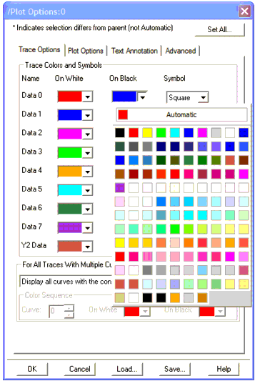
Trace Options
The Trace Options tab enables you to define trace colors and symbol shapes for all plots except Scatter, Histogram, and CDF plots. If you select Automatic, the default IC-CAP settings is used. If you select a specific color, an asterisk (*) is display next to the color to indicate that it is not the default color.
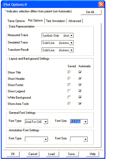
Plot Options
The Plot Options tab enables you to define Data Representation, Layout and Background, and Text Font. However, for Scatter, Histogram, and CDF plots, the Data Representation section is not available.
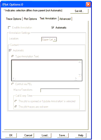
Text Annotation
The Text Annotation tab enables you to add annotation text to document information such as date, lot number, simulation parameters, and so on. You can either directly enter text annotation or you can specify a PEL macro (see Annotating a Plot Using a PEL Macro).
Advanced
The Advanced tab enables you to specify a PEL callback (macro or transform) to run whenever the selected plot in a Multiplot changes. Note that reselecting the same plot will not invoke the callback.
To specify a PEL callback, unselect Automatic then type in the callback path and name. Using a relative path, the callback is found relative to the Multiplot. Therefore, the path for macros is ../../MacroName and for transforms is ./TransformName. This is true regardless of where you open Plot Options. For example, if you open Plot Options from the Model window, the relative path for a macro is still ../../MacroName.
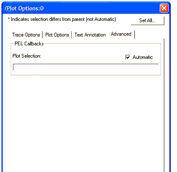
The callback passes 3 arguments to the PEL function that are received by calling linput 3 times at the beginning of the callback. The first linput receives the name of the Multiplot where the selection is occurring. The second linput receives the new slot number selected (according to the entries on the plot definition, i.e., Plot 0 will be slot 0, Plot 2 will be slot 2, and so on). The third linput receives the old, no longer selected, plot number. A slot number of -2 indicates that no plots were selected.
Example Plot Selection Callback
-
linput "plot?",plot
-
linput "slot?", slot
-
linput "oldSlot?", oldSlot
-
print "newSlot=";slot;" oldSlot=";oldSlot;" Plot: ";plot
Restrictions
| • |
This callback can only identify when the selection changes. Currently no mechanism exists that can detect when a plot is clicked on again, reselecting the same plot. |
| • |
Calling iccap_func() with "Select Plot" is not allowed during the selection callback and doing so will have no effect. Selection can occur just prior to displaying a right click menu or at the start of a click and drag. Changing the selection at these moments would be problematic, and allowing selection changes for some selections but not others can be equally problematic, so it is not allowed. |
| • |
Deleting the invoking Multiplot or the plot that is being selected is not allowed during the selection callback. |
| • |
You can modify Multiplot entries during a callback, but any call to Replot will do nothing during the callback. This is because changing a graph between selection and display of the right mouse menu can lead to problems. |
| • |
In general you should not change the Multiplot, its selection, or any of the child plots during a selection callback. The purpose of the callback is to allow an embedded GUI to change states in reaction to the selected plot. |
Multiplot Layout
The Layout tab enables you to define the layout and background settings for a Mulitplot.
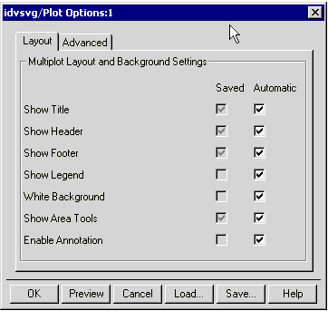
Setting Other Plot Characteristics
You can enable or disable several other plot characteristics that are available on the Plot window's Options > Session Settings menu. Although IC-CAP only retains these settings during the current session, you can save the current setting to Plot Options, or you can reset your settings back to the saved Plot Options.
| • |
Area Tools turns the graph's area tools on or off. |
| • |
Legend turns the graph's legend on or off. |
| • |
Text Annotation turns the graph's text annotation on or off. |
| • |
Title turns the graph's title on or off. |
| • |
Header turns the graph's header on or off. |
| • |
Footer turns the graph's footer on or off. |
| • |
Exchange Black-White reverses the black and white settings for the graph's grid, text, and background. |
| • |
Color turns color on or off for the traces and markers. When Color is off, the traces and markers are the same color as the graph's grid and text. |
| • |
Reset to Saved Options resets the current session settings back to the saved Plot Options. This menu pick is not available from Scatter, Histogram, or CDF plots that were opened by the Statistic Package. |
| • |
Save Current Settings saves the current session's settings as the saved Plot Options. This menu pick is not available from Scatter, Histogram, or CDF plots that were opened by the Statistic Package. However, for these plots you can open the Plot Options dialog box from the IC-CAP/Main window to save the settings. |
Saving a Plot Image
You can save an image of a plot with its current characteristics and size.
To save a plot image:
| 1 |
Select File > Save Image. |
|
Note
|
|
|
|
|
On Windows, if the plot image is partially hidden by another window when you select Save Image, the saved plot image will be obscured by that window. Therefore, make sure the plot image is not partially hidden by another window before you select Save Image.
|
|
| 2 |
In the Plot Image File Name dialog box, set the location where you want to save the file. |
| 3 |
Enter the file name in the form of filename.ext where ext is gif or jpg. |
|
Note
|
|
|
|
|
You can save plots in various formats in Plot windows, by using the File > Save Image menu item. This feature uses ImageMagick's "Convert" program. See Help > About IC-CAP for more information. Agilent Technologies officially supports the .GIF and .JPG formats, though .EPS, .PS, .HTML, .TIF, and other formats are available.
|
|
| 4 |
Select OK or Save. There may be some delay while IC-CAP processes the image. |
|
Note
|
|
|
|
|
On Windows, you can copy a plot image to the Windows clipboard, paste it into another applications (such as Microsoft Paint), then save it in the other application.
To copy a plot image to the Windows clipboard, select Options > Copy to Clipboard or press Ctrl+C on the keyboard.
|
|
Annotating a Plot Using a PEL Macro
Each plot can read a text file and display this text next to its graph. The text area is 40 characters by 25 lines maximum for the USASCII character set (see ANNOTATE_CSET in the section "Annotation Variables").
To add annotation text to a plot:
| 1 |
Create a Macro program to generate an annotation text. |
| 2 |
Assign appropriate values to annotation system variables. |
Annotation Variables
The variables that control the annotation in a plot can be defined at any level, providing flexibility and programming capability. These variables are:
| • |
ANNOTATE_MACRO. This variables sets a macro name which is executed by a plot for generating annotation text. If this variable is undefined or blank, then no program is executed. A model name may precede a macro name to locate a macro in another model (for example, /npn/legend). |
| • |
ANNOTATE_FILE. This variable sets a file from which a plot reads in annotation text. When this variable is undefined or blank, a plot does not read a file to update its annotation. |
| • |
ANNOTATE_AUTO. When this variable is either Y or Yes, then a plot updates its annotation whenever its datasets are updated, for example, when measured or simulated. Otherwise, the annotation is updated when a plot window is opened or its menu choice Update Annotation is selected. |
| • |
ANNOTATE_CSET. This is an optional variable to specify a character set for the text. A 16-bit character code is possible by giving a value like jpn, korean, or chinese-t when NLIO (Native Language I/O) is installed. If this variable is undefined or blank, a default character set (usascii as set in $ICCAP_ROOT/config) is used. |
Annotation Example
The annotation example shows how to use the annotation text from the example plot used in this chapter. The following table shows variable values for this example, except ANNOTATE_FILE, which is defined in the legend macro program.
Table 50 System Variables for Annotation
|
|
ANNOTATE_MACRO
|
legend
|
ANNOTATE_FILE
|
|
ANNOTATE_AUTO
|
No
|
ANNOTATE_CSET
|
|
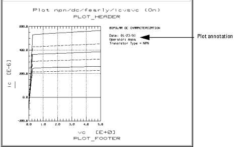
The legend macro program is shown in the following figure. This macro sets the ANNOTATE_FILE variable and writes text into this file. Later, a plot reads this file automatically for its annotation.
Figure 39 A Macro Program for Annotation
 ! Plot annotation generation program
!
file_name = system$("echo $HOME/.icplotnotes")
ANNOTATE_FILE = file_name
x = system("rm " & file_name)
!
printer is file_name
!
print "BIPOLAR DC CHARACTERIZATION"
print
print "Date: "; system$("date +%D")
print "Operator: "; system$("logname")
print "Transistor Type = "; POLARITY
!
printer is CRT
|
Advanced Annotation
Annotation for Each Plot
Multiple plots in a single setup share the same annotation macro and text file. To have different annotation for each plot in a single setup, create a macro program that generates texts and opens each plot in turn. In this case ANNOTATE_MACRO should be blank.
16-bit Code Annotation
If you have installed NLIO for 16-bit character code such as Japanese, plots can display these native languages by assigning an appropriate character set to ANNOTATE_CSET. A macro program can include these 16-bit characters in a string and print them out into a file. However, you need to use an external text editor such vi in an hpterm window to input such characters. To edit a macro program with vi, add a new macro program in IC-CAP, write it out to a file, edit this file with vi, and then read it back into IC-CAP. IC-CAP can show you these 16-bit characters in a Macro Editor if a 16-bit code font is assigned. For example, for Japanese font, execute the program with the option shown below. Be sure to specify jpn for ANNOTATE_CSET in this case.
iccap -xrm "iccap*XmText.?*FontList: jpn.8x18"
|