Example—Building a Statistical Model
To introduce IC-CAP Statistics, let's go through the typical steps needed to build a parametric statistical model, using parameters for a common semiconductor device model. We will:
| 1 |
Measure and extract model parameters |
| 2 |
Start IC-CAP Statistics and import data |
| 3 |
Transform distributions to Gaussian |
| 5 |
Perform correlation analysis |
| 6 |
Perform factor or principal component analysis |
| 7 |
Generate model equations |
| 8 |
Generate models from parametric analysis |
|
Note
|
|
|
|
|
The example we use to introduce IC-CAP Statistics is based on a parametric analysis, which assumes a Gaussian distribution of the data. IC-CAP Statistics also contains non-parametric analysis, which can be used when the data is bimodal or otherwise non-Gaussian. This method is described briefly at the end of this chapter and in depth in the Parametric Analysis Results Window.
|
|
Measure and Extract Model Parameters
First you measure and extract the parameters needed for your device model using IC-CAP software or another parameter extraction program. This procedure is described in Chapter 5, "Making Measurements," in the User's Guide. The data is then imported into IC-CAP Statistics.
Start IC-CAP Statistics and Import Data
Start IC-CAP Statistics:
From the Main IC-CAP window choose the Tools drop-down menu and then choose Statistics (or click the Statistics icon). The Statistics package window is displayed.
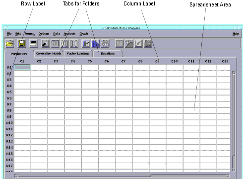
Figure 1 IC-CAP Statistics Window
|
|
There are four ways to begin working with IC-CAP Statistics:
| • |
Importing an ASCII text file containing your data (such as from Excel) |
| • |
Loading extraction data directly from IC-CAP |
| • |
Opening a file already in the IC-CAP Statistics data file (.sdf) format, which is based on the MDIF file format |
| • |
Manually typing the data in the Statistics spreadsheet |
For this overview, we will use the third method, and open an example file called bsim3.sdf.
|
Note
|
|
|
|
|
This BSIM3 data file is being used to teach you how to use the program only. It does not contain validated data. Do not be concerned if you primarily use other types of models.
|
|
| 1 |
From the File menu, choose Examples. The Examples Open dialog box appears. |
| 2 |
Select bsim3.sdf from the list of files and choose OK. |
| 3 |
The spreadsheet is loaded with data. |
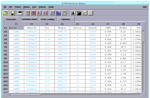
The spreadsheet displays the data in rows and columns. Each row contains one sample. Each column contains either a sample's attribute, such as the sample ID, lot number, date, or temperature; or is a sample's measured or extracted data, such as VSAT, VTH0, or TOX. Attribute information is displayed in blue, while parameter data is displayed in black.
Spreadsheet Format
The data may contain too many characters to fit in the cells. From the Format menu, choose Column Width, a dialog box appears. You enter a larger or smaller number in the field to fit your data. In this case, accept the default of 10 and choose OK.
Transform Data
One of the key assumptions made by multivariate techniques such as Factor Analysis is that the data set to be analyzed is a joint Gaussian distribution. If the data is not joint Gaussian, then the model generated from the analysis may not accurately reproduce the measured density.
One of the ways to help convert a data set to Gaussian is to perform a mathematical transformation.
You have to decide which data columns need to be transformed. Some columns may already be Gaussian. As described below, you can quickly plot the data to see if it is Gaussian. The next step, Eliminate Outlier Data, can be done before the data transformation step, depending on the look of the data.
Selecting Columns and Rows
The spreadsheet columns have the labels C1, C2, C3, etc., just above the columns. The rows have the labels R1, R2, R3, etc., just to the left of the rows. See Figure 1. To select an entire column or row, move the cursor to the column or row label you want and press the left mouse button.
Plot and Analyze the Data
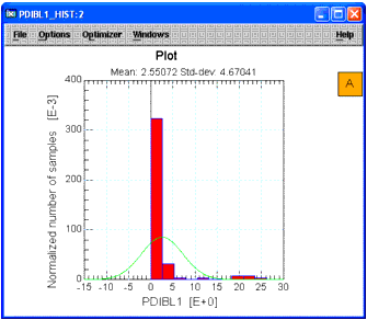
To view the data before transforming it, we will plot the data for column C8 as a histogram.
| 1 |
Select column C8 (parameter PDIBL1) by clicking column label C8. The column is highlighted. |
| 2 |
From the Graph menu choose Histogram (or click the Histogram icon from the toolbar). A plot window appears with the histogram for that column. |
Figure 2 Histogram Before Data Transform
|
|
- When you are done viewing plots, you can choose File > Close from the Plot window.
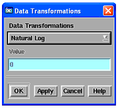
Transform the Data
| 1 |
Select column C8 again. |
| 2 |
From the Data menu, choose Data Transformations. A dialog box appears. |
| 3 |
To select a transformation type, click the drop-down list button and select the type you want. |
| 4 |
For this example, choose Natural Log and choose OK. The data for column C8 is transformed. |
- The parameter name is appended with LN (for log natural) and becomes LN_PDIBL1.
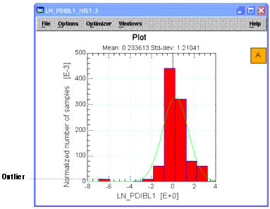
Re-plot the histogram for column C8. Select column C8. From the Graph menu choose Histogram. Note that the data is now more Gaussian, but there is an outlier to the left.
Figure 3 Histogram After Data Transform
|
|
Eliminate Outliers
There are several ways to eliminate outlier data or other invalid data. You can vary the order in which these methods are done. For example, you may immediately spot bad data and manually eliminate it, you can automatically filter the data to remove outliers, or you can plot the data in a histogram or scatter plot to help spot outliers. Often several iterations of these methods have to be performed until you're satisfied that the data is ready for correlation analysis.
Plot and Analyze the Data
To help spot outlier data, let's study the latest plot, above, for column C8. Note the that there appears to be an outlier at the far left of the plot, corresponding to a value of about -6.9. If you scan the data in the column, you will see that this value is in row R20.
Manually Eliminate Outliers
Let's assume that from a review of the data, you believe the sample in row R20 is a bad sample.
| 1 |
To select this row, click row label R20. |
| 2 |
From the Edit menu choose Deactivate. The row's background color changes to gray indicating that this sample is deactivated (to re-activate it, choose Edit > Activate). |
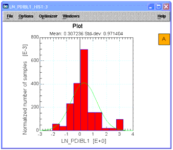
| 3 |
Select column C8 again. From the Graph menu choose Histogram. See that the plot is more Gaussian with the outlier eliminated. |
Figure 4 Histogram After Outlier Elimination
|
|
Automatic Data Filtering
IC-CAP Statistics can automatically filter data based on minimum/maximum values or by a scale value. We will use a scale value. Scale is defined as the median absolute deviation (MAD) divided by a constant (approximately 0.6745). This standardizes MAD in order to make the scale estimate consistent with the standard deviation of a normal distribution. The greater the scale value, the further from the median the filtering occurs.
| 1 |
Select column C8 again. |
| 2 |
From the Data menu choose Data Filter. A dialog box is displayed. |
| 3 |
Accept the default Scale option (near top) to filter by a scale value. |
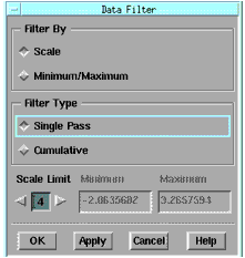
| 4 |
Change the Scale Limit (near bottom) to 4 by clicking the right arrow or typing in the field. Then choose OK. |
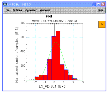
- The data is filtered based on this scale value. Note that eliminated rows are highlighted by a color change that indicates they have been filtered out. (The process can be undone by choosing Data > Undo Data Filtering.) Select column C8 once again. From the Graph menu choose Histogram. See that the plot is now more Gaussian with the data filtered.
Figure 5 Histogram After Data Filtering
|
|
Choose Statistical Summary for a Numeric Display
Besides a variety of plots to help you analyze your data, IC-CAP Statistics also has a Statistical Summary window (Analysis > Statistical Summary), which shows you standard statistical data, such as mean, variance, standard deviation, skewness, kurtosis, etc.
Repeat Data Transformation and Outlier Elimination for Other Columns
Repeat the steps outlined in the last two sections for each column that is non-Gaussian. For this example, you can skip this step.
Perform Correlation Analysis
Correlation analysis provides a numerical measure of the amount of variation in one variable that is attributable to another variable. When an increase in the value of one variable is associated with an increase in the value of the other variable, the correlation is positive. When the increase is associated with a decrease, the correlation is negative.
Correlation analysis is always performed before proceeding to factor analysis and the data used consists of all the rows in the spreadsheet that have not been filtered, deactivated, or deleted. To perform correlation analysis:
From the Analysis menu, choose Correlation Analysis. The Statistics window changes so that the Correlation Matrix folder is displayed. (If you want to go back to the parameter data before correlation analysis was performed, choose the folder tab labeled Parameters.)
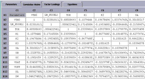
The Correlation Matrix displays the same parameters down the rows and across the columns. The correlation coefficients for any two parameters are displayed where the rows and columns intersect. In the above example, the cell formed by R4 and C2 has a value of about 0.69, which shows moderate to strong correlation between parameters TOX and VTH0.
Perform Factor Analysis
Now that the correlation matrix is defined, the next step is to perform factor analysis.
| 1 |
From the Analysis menu, choose Factor Analysis, a dialog box is displayed. |
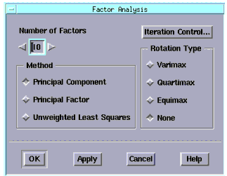
- You choose the method of factor analysis from three choices: Principal Component, Principal Factor, or Unweighted Least Squares.
- The Principal Component and Principal Factor methods, while quite different in assumptions, are similar in the end effect; the main difference lies in their respective error terms. Unweighted Least Squares is a method of factor analysis using an iterative process. A detailed description of these methods can be found in Chapter 3, "Data Analysis."
- You choose a starting figure for the number of factors you want to be found in your analysis. After you see the results, which correspond to the percent variation that can be explained by this number of factors, you can increase or decrease the number and repeat the analysis.
| 2 |
For our example, enter 10 in the Number of Factors field. |
| 3 |
In the Method field, choose the default Principal Component option button. |
| 4 |
Accept the default Rotation Type of None. |
| 5 |
Choose OK to perform the analysis. The screen changes to display the Factor Loadings folder. |
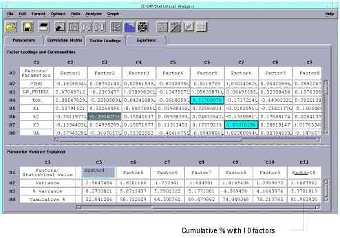
- Two tables are generated in this window; the first contains the factor loadings. Factor loadings represent the correlations between each factor and the model parameters. The second table presents a summary of the variances associated with each factor as well as a report of the percentage error explained by each factor.
- Note that the cumulative percent for 10 factors, shown in the lower right cell, is about 82% (you may have to use the scroll bar to see it). This means that if only 10 factors were used to make a statistical model from this data, the model would explain 82% of the variance compared to using all of the parameters/factors.
| 6 |
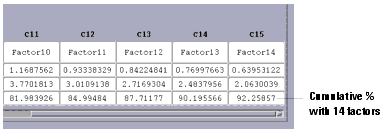
Now we will re-analyze using 14 factors. Choose Analysis > Factor Analysis and enter 14 in the Number of Factors field. |
- With 14 factors, the cumulative percent is about 92%, as shown in the lower right cell below. You have to decide how high a figure is acceptable for your work.
The top portion of the Factor Loading folder displays the data in a color-coded format. Factor Group data, one group per row, is displayed in a red font. Dominant Parameter data, one dominant parameter per column, is displayed with a blue background. A detailed description of both can be found in Perform Factor Analysis.
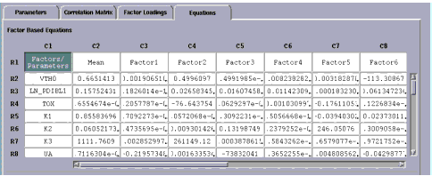
Generate Equations
Next, we will generate equations from the factor analysis. You can generate equations from factors or dominant parameters. IC-CAP Statistics computes the equation coefficients that you use to build your SPICE model.
From the Analysis menu choose Generate Equations. A submenu with two choices appears to the right. Choose Factors. The screen changes to display the Equations folder
.
Generate a Parametric Model
Now that the equation coefficients are generated, you can build a variety of statistical models, or save the data in a SPICE equations format for use in circuit simulations. You can choose from Monte Carlo, Corner, or Parametric Boundary models. You can test your model, based on a reduced set of parameters, against the raw data to see how well it performs. At this point, IC-CAP Statistics has been designed for flexibility to work with your process.
For our example, we will perform Monte Carlo analysis and compare the results to the raw data.
Perform Monte Carlo Analysis, Plot Data, and Compare
| 1 |
From the Analysis menu choose Parametric Analysis. A submenu is displayed to the right. Choose Factor Equations, a dialog box is displayed. |
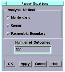
| 2 |
Choose the Monte Carlo method. |
| 3 |
In the Number of Outcomes field, enter 500 and choose OK. |
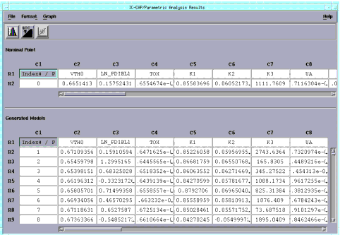
- The results of the Monte Carlo analysis are displayed in the Parametric Analysis Results window. The number of rows is equal to the number of Monte Carlo outcomes, and the columns correspond to the parameters.
Figure 6 Parametric Analysis Results Window
|
|
- Earlier we used parameter PDIBL1 to plot as a histogram, and transformed the data to a more Gaussian fit, see Figure 5.
| 4 |
Now, select the column for parameter PDIBL1 (now labeled LN_PDIBL1 because we did a log transform of the data) in the Parametric Analysis Results window. |
| 5 |
From the Graph menu choose Histogram. |
| 6 |
Compare this plot (made from synthesized Monte Carlo data) with the earlier plot. |
Details on Corner Models and Boundary Models are found in Generate a Parametric Model.
Non-Parametric Boundary Modeling
IC-CAP Statistics contains proprietary Agilent EEsof non-parametric analysis algorithms for identifying nominal models and worst-case-candidate models from arbitrary joint probability densities. This advanced feature, called Non-Parametric Boundary Modeling, differs from the parametric (joint Gaussian) methods described earlier, and can be used when the data is bimodal or otherwise non-Gaussian.
Details on Non-Parametric Boundary Modeling are found in Parametric Analysis Results Window.
|