Print version of this Book (PDF file)
Histogram
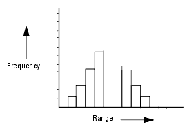
A histogram depicts either the frequency or the relative frequency of data distribution. It is typically used to identify both the ranges around which most of the data converges and the outliers of the data set. In a histogram, the x-axis displays the value ranges while the y-axis plots the frequency (or relative frequency) for each range.
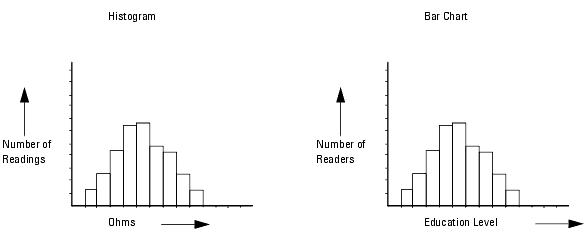
A histogram is mainly used for the visualization of data for a single variable. It is different from a bar chart primarily because of the kind of data it displays, quantitative as opposed to qualitative. While a bar chart is used to display frequency data for qualitative variables, a histogram is used to display frequency data for quantitative variables.
Values of quantitative variables are based upon actual units of measure, and hence they are measurements. Values of qualitative variables, on the other hand, vary in kind but not in degree, and hence they are not measurements.
For example, a histogram best depicts the frequency distribution of recorded parasitic gate resistance for a given setup because each data variable has a quantitative value, based upon a unit of measure. On the other hand, a bar chart is better suited to depict the distribution of readership for a magazine when each range represents a qualitative distinction, the education level of each respondent.
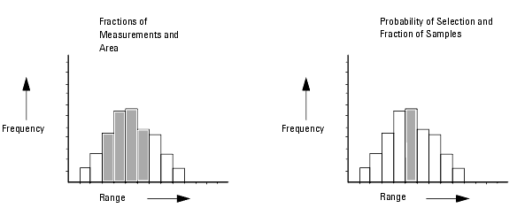
The number of measurements in an interval as a fraction of all the measurements is equal to the area of the interval as a fraction of the total area of the histogram. In addition, the probability of a random selection lying within an interval is equal to the fraction of the total number of samples within that interval.