Print version of this Book (PDF file)
Graphing Data
After you load the raw data, you may want to plot the data for a given parameter in one or more formats. Or, you may want to re-plot the data after performing a mathematical transformation or manipulation. To create a graph, choose Graph and then the type of plot you want (such as Histogram). IC-CAP Statistics contains the following type of plots:
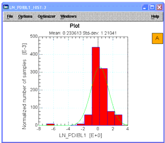
IC-CAP's Statistic Analysis Histogram is normalized. The definition of the histogram normalization is as follows:
- Variable X indicated the width of the histogram bin,
- Variable n indicated the number of the histogram bins.
- Variable Yi indicated the number of samples for the histogram bin with index of i
- Variable normalize_Yi indicated the normalized number of samples for the histogram bin with index of i
- Variable n indicated the number of the histogram bins.
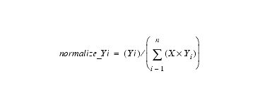
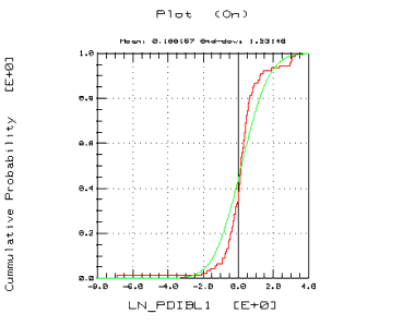
Figure 9 Cumulative Density Plot
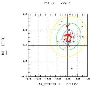
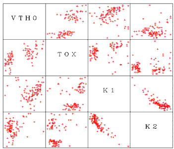
The scatter plot matrix contains multiple scatter plots, with each parameter plotted against every other parameter. For example, if your data had four parameters, P1, P2, P3, and P4, the matrix would contain 16 cells. First would be P1 against itself (only the label appears), then P1 vs. P2, P1 vs. P3, and then P1 vs. P4. The next row would contain P2 vs. P1, the P2 label, P2 vs. P3, and P2 vs. P4, and so on. If you have a large number of parameters, the plots will be quite small. Select the columns you want to plot and choose Graph > Scatter Plot Matrix.
More information on of each of these plots can be found in Chapter 4, "Data Visualization."